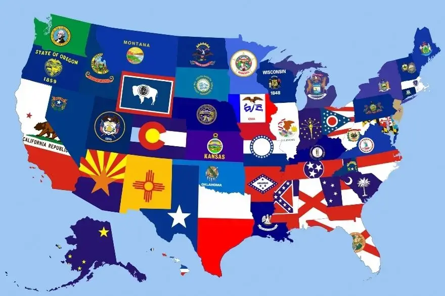
State Flag Colors: What They Mean
Blue, red, gold, green, white, and black aren’t just decoration— they’re shorthand for values, landscapes, and heritage. Here’s how to read them.
How to read color on a state flag
Think: values, landscape, and heritage—encoded in a palette.
Three quick cues
- • Values: courage (red), justice (blue), prosperity (gold).
- • Place: deserts (gold), forests (green), lakes/sky (blue).
- • Heritage: Spanish red/gold (New Mexico), heraldic contrasts (Maryland).
Context matters
- • Colors shift meaning with symbols (e.g., a gold sun vs. a gold wheat sheaf).
- • Repeated palettes often trace to shared history, not copycats.
- • Text readability and contrast drive a lot of choices.
Blue
Justice, unity, sky and water. Also: the default canvas for seals.
Blue (Navy / Deep Blue)
Traditionally signals vigilance, justice, and stability. On many state flags it also stands in for sky and lakes—and doubles as the ‘official’ backdrop for coats of arms.
Examples: Pennsylvania, New York, Michigan, Wisconsin, Montana, Nebraska
If you see a detailed coat of arms on blue, you’re probably looking at a legacy ‘seal-on-blue’ design.
Bright & Sky Blues
Leans more toward ‘open skies’ and modern clarity. Shows up in redesigns and Western states with strong landscape identity.
Examples: South Dakota (sunburst blue), Alaska (night sky), Colorado (blue bands)
Red
Courage, revolution, and instant contrast.
Scarlet / Flag Red
Energy and bravery—plus unmatched visibility at a distance. Often used for stripes, stars, or bands that need to pop.
Examples: Texas (stripe), Tennessee (field + fly bar), Colorado (red ‘C’), Ohio (stripes)
Crimson Saltires
Diagonal crosses tied to history and heritage—most notably the saltires in the Deep South.
Examples: Alabama (crimson saltire), Florida (red saltire + seal)
Gold / Yellow
Sunshine, prosperity, wheat, deserts—bright on purpose.
Gold (Warm Yellow)
Reads as sunlight and abundance. In the Southwest it can lean ‘desert’; in farm states it nods to wheat and harvest.
Examples: New Mexico (Zia sun), Colorado (gold disk), Kansas (sunflower + seal)
Heraldic Gold Accents
Trim, stars, and lettering that add hierarchy without stealing the show.
Examples: Oregon (gold text and seal), Indiana (gold torch + stars)
Green
Forests, agriculture, and ‘we grow things here.’
Forest & Pine Greens
Nature-forward states use green to telegraph forests and fields.
Examples: Maine (pine in arms), Vermont (green landscape on arms), Oregon (beaver state references)
Accent Greens
Leaves, wreaths, and agricultural motifs inside seals.
Examples: Pennsylvania (olive branches), Mississippi (magnolia leaves)
White
Clarity, peace, and high-contrast staging.
White Fields & Shapes
Neutral field for seals or a crisp base for strong icons; also reads as purity/peace in traditional symbolism.
Examples: Massachusetts (white field + arms), Rhode Island (white field + gold anchor)
White Symbols
When icons are white on a dark field, it’s usually a legibility play.
Examples: South Carolina (white palmetto & crescent on blue), Wyoming (white bison silhouette)
Black
Weight, outline, and heraldic contrast.
Black Accents
Used sparingly to add definition or heraldic contrast—rarely a main field color on state flags.
Examples: Maryland (heraldry includes black), various seals for outlines/text
If you’re seeing a lot of black, it’s probably a coat of arms element or heraldic quartering.
Dark Neutrals
Modern redesigns sometimes use very dark neutrals to create depth without pure black.
Examples: Some contemporary proposals and city flags; less common on official state flags
Color Comparisons You’ll Actually Use
Fast side-by-side ideas to teach or remember.
Southwest Sun vs. Sunburst Blue
- • New Mexico: Red/Gold (Spanish heritage) + Zia sun = culture + cosmos.
- • South Dakota: Sky blue + gold sunburst = plains + openness.
Seal-on-Blue vs. Minimal Icons
- • Pennsylvania, Michigan: Navy backdrop, complex arms (tradition).
- • Tennessee, Colorado: Bold shapes, instant read at distance (modern legibility).
Quick Read: Decode Color in 10 Seconds
Color heuristics
- • Blue = official, sky/water, justice.
- • Red = courage, contrast, look-at-me elements.
- • Gold = sun, prosperity, wheat/desert.
- • Green = forests, agriculture.
- • White = clarity, peace, readability.
Keep exploring
- • See symbols in action: Common Symbols on State Flags
- • Compare color-forward flags: New Mexico, Colorado, Tennessee.